Branch opening that unblocked
seller entry into Full

E-commerce Discovery Service design Backoffice Mercado Livre 2024
5 rejection causes blocked upfront, not weeks later
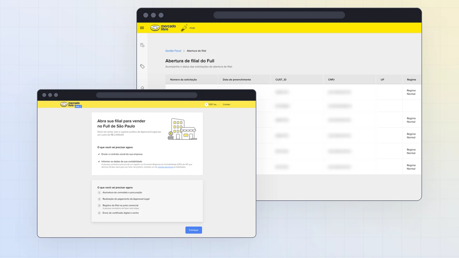
Case cover: branch opening welcome screen over the backoffice requests table Case cover: branch opening welcome screen over the backoffice requests table
Role
Product Designer
Team
Rayane Navarro · Henrique Caprara · Mariana Amorim · João Silveira
Duration
1 quarter (Q3 2024)
Scope
Seller flow, backoffice and email journey

Selling through Full in São Paulo
meant leaving Mercado Livre

Full is Mercado Livre's fulfillment service: sellers send inventory to a Meli distribution center and get faster delivery and more visibility on their listings. But there's a tax barrier: sellers under the standard tax regime headquartered outside São Paulo must open a branch in SP to sell through Full there.

The process was run with a third-party firm, Approved Legal, which handled the legal side. In practice, sellers lived an experience 100% outside Mercado Livre: forms built on Monday, internal management in spreadsheets and manual queries, and all follow-up through a long chain of emails from a sender they didn't know.

Meli wanted to scale the number of sellers on Full, but the funnel leaked right at the first step. And no one inside the company knew exactly where, or why.

April 2024 activation
Sellers invited406
Forms completed62
Branches opened25

15.3% reached the form and only ~6% finished opening a branch. Among farming sellers, already on Full, conversion dropped to 5% and 3%.

The drop wasn't lack of interest:
it was lack of clarity and trust

Sellers invited to Full were giving up before even filling in the form, because the whole process happened outside Mercado Livre: emails from an unknown company, costs and prerequisites revealed too late, and 14 touchpoints until completion.

When customer support reached out to those who didn't move forward, the pattern was clear:

76%
never started filling in the form
45%
of those who started had questions about costs, taxes or documents
24%
of those who didn't fill it in simply couldn't find the email with the link

Before designing,
I became the user

The original brief was small: turn one of Approved's forms into an on-screen experience. Before opening Figma, we needed to understand the real process, not the one described in internal slides.

01
Mystery shopping the full process
I went through the real branch opening flow, receiving and filing Approved's actual emails. It surfaced evidence no stakeholder had consolidated:
  • The service fee, R$ 2,000, only showed up in a PDF proposal midway through, after the seller had already decided to join.
  • Sellers only learned after the form that their accountant needed a São Paulo CRC registration, a 10-business-day request that stalled everything.
  • Emails full of cryptic jargon, and redundant data requested twice in different forms.
  • A serious security flaw: municipal passwords sent in plain text, and requests for the company's digital certificate and password by email.
02
Seller research through customer support
The support team contacted sellers who didn't move forward and we consolidated the reasons: questions about costs and taxes, internal approval needed, distrust in the communication and lost emails.
03
AS IS service blueprint
I mapped the entire process with a line of visibility: seller, accountant, Approved, Meli's Tax Experience team and the channels at each step (Monday, Mercado Pago, e-signature platform, Commercial Registry, city hall). Result: 14 touchpoints, 3 external actors and a backoffice that relied on manual queries to know the status of each request.
04
Three findings that changed the scope
Redesigning only the form would have been a band-aid:
  • The problem started before the form. If 76% never started, the entry point and communication mattered more than the fields.
  • The problem continued after the form. Email-only follow-up drove distrust and drop-off midway.
  • Meli had no management tool. Without a backoffice, scaling volume would only scale operational chaos.
05
Two TO BE versions, one deliberate decision
I designed two future flows as service blueprints to discuss with product and engineering. Version A brought everything into Mercado Livre: payment via Mercado Pago, integrated signatures and on-screen tracking. Version B had Meli own the entry point, screening and communication, the steps with the highest proven drop, keeping Approved as the legal executor behind the line of visibility.

I advocated for version B as Phase 1. Not because A was worse for users, but because it depended on integrations that didn't fit the quarter's engineering capacity. Version A became the roadmap, documented and prioritized.

I'd rather ship a cohesive flow for one slice of the process than ship the whole process halfway.

Meli owns the entry point,
screening and communication

Phase 1 covers three fronts: the seller flow inside Mercado Livre, a backoffice for the tax team, and the email journey that keeps guiding the seller to the end.
01
Cost and prerequisites before any field
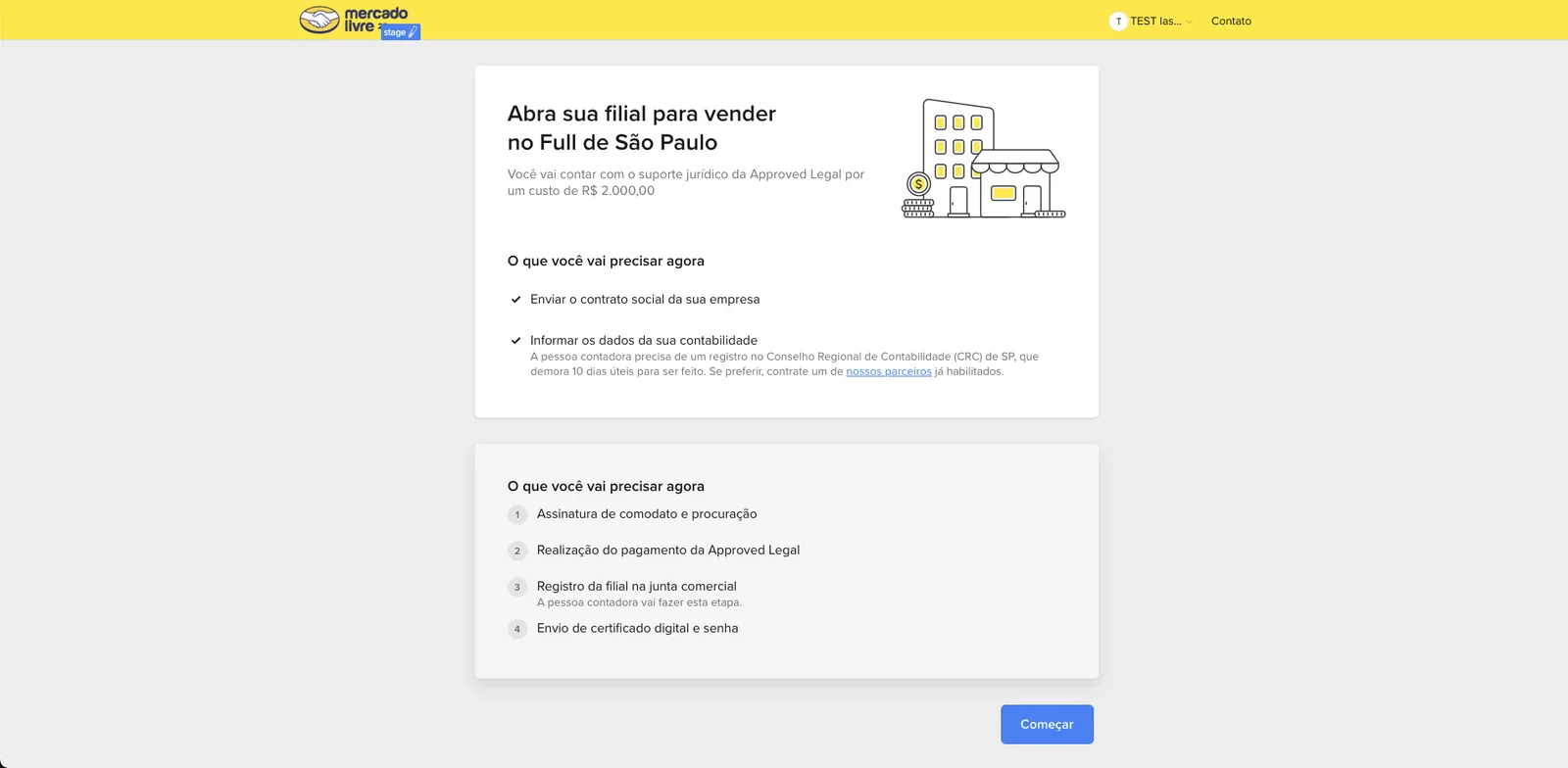
Instead of dropping sellers straight into the form, a welcome screen summarizes the process, introduces Approved, shows the service fee and flags the CRC-SP accountant requirement. Cost, taxes and CRC were the biggest sources of doubt: revealing them at the end only moved the drop to a more expensive step. Sellers from Rio de Janeiro, who register with JUCERJA at a different cost and with different steps, got an explicit variant of the screen and emails.
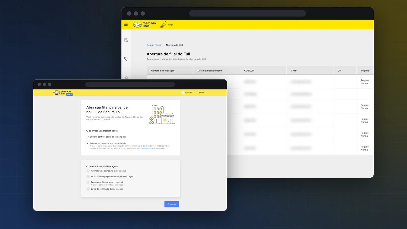
Welcome screen (in Portuguese): open your branch to sell through Full in São Paulo, with the R$ 2,000 fee, what the seller needs now and the next steps
The welcome screen separates what the seller needs now from what comes next, with the fee and the accountant requirement right at the top.
02
Blocking screens instead of rejections weeks later
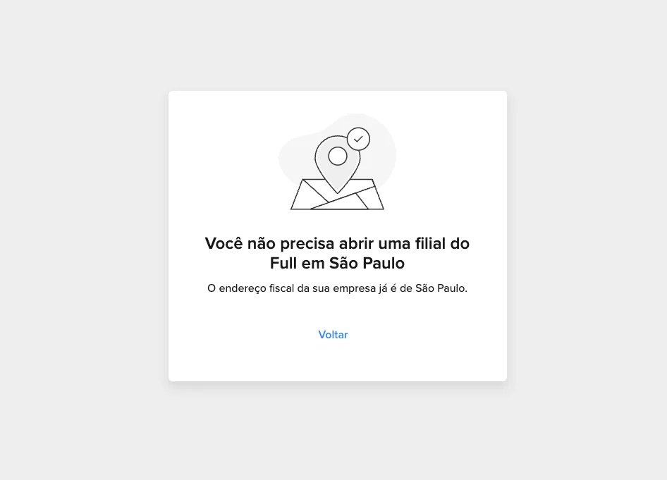
We mapped 5 conditions that prevent opening a branch and designed a screen for each, explaining why and pointing to a way out when there was one. Before, these sellers entered the funnel and were rejected by email weeks later.
Blocking screen (in Portuguese): you don't need to open a Full branch in São Paulo, your company's tax address is already in São Paulo
Blocking example: sellers whose tax address is already in SP learn right away they don't need a branch.
Individual Individual (non-business) accounts can't open a branch.
Simples / MEI Simples Nacional companies without active Full, or MEI, don't qualify.
Address in SP The company's tax address is already in São Paulo.
State registration The company doesn't have a State Registration yet.
Invoicer Opting in to Mercado Livre's invoicer is a prerequisite.
03
A hub with independent steps
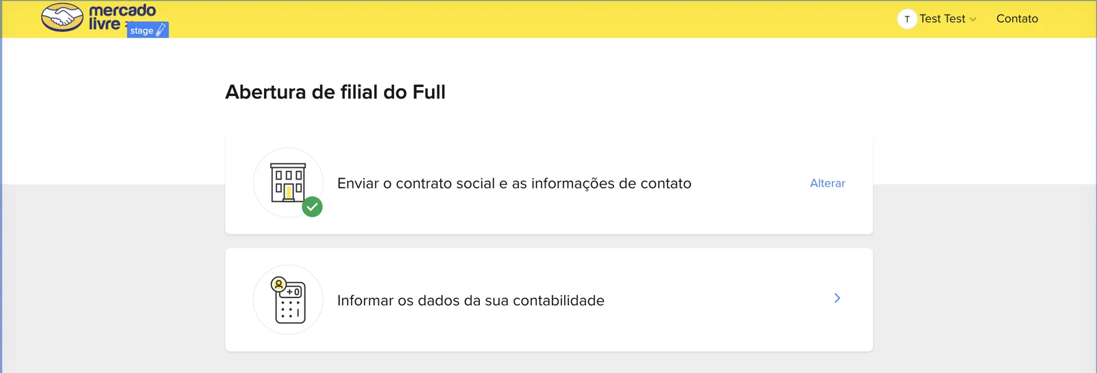
The form became a hub instead of a single linear flow. Sellers depend on others to fill it in (accounting data comes from their accountant), so the hub lets them complete it in parts, save and come back. In step 1 they review company data, upload the articles of incorporation and the contact person; in step 2 they add accounting details, with the address autofilled from the ZIP code. Once done, the card returns to the hub marked as completed, with an option to edit.

States were designed too: a loading micro-interaction on submit, a success screen with next steps and a system error screen with retry. Sellers never hit a dead end.
Full branch opening hub (in Portuguese) with two steps: articles of incorporation and contact info already sent, and accounting details pending
The hub shows the state of each step, built to take on new steps in later phases.
04
Minimum viable backoffice
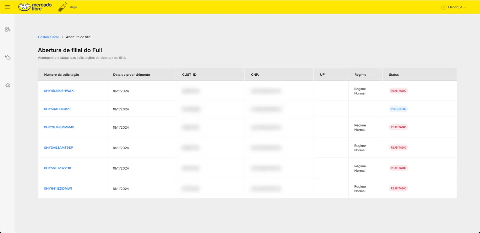
In SBO, under the Tax management tab, the Tax Experience team got a requests table with status filters and a review screen. Approving shows a snackbar with undo, guarding against accidental clicks, and rejecting requires a reason, because that reason feeds the communication with the seller. I deliberately negotiated this cut with product to speed up development; richer data was mapped as a follow-up.
Backoffice in SBO (in Portuguese): branch opening requests table with number, date, tax regime and status
For the first time Meli could see every request without manual queries or Monday. Identifying data hidden.
05
The email journey was experience too
With on-screen tracking moved to Phase 2, emails were the experience. I rewrote 7+ templates in Meli's voice, with subject and preheader specified, covering the happy path (payment, confirmation, Commercial Registry filing, Full activation, final documents), error variants and RJ variants. Approvals and rejections in the backoffice trigger an automatic email minutes later. Reviewing with the tax team, we found an email that didn't exist but needed to: the SEFAZ password.

The project was handed off fully specified for development at the end of the quarter. What I report here is baseline, success metrics and process gains, without making up a post-launch conversion number that didn't exist yet.

5
Rejection causes upfront
Blocked at entry, instead of rejected by email weeks later
10 days
Of waiting surfaced early
The CRC-SP requirement is now communicated before the seller starts
SBO
Dedicated backoffice
Requests managed without manual queries, spreadsheets or Monday

A visible funnel for the first time. The 15.3% (hunting) and 5% (farming) baseline was documented, and success metrics were set with product: drop after starting the form, time to completion and volume of support questions.

Impact beyond scope. Mystery shopping exposed passwords and digital certificates being sent by email, which was logged as a risk and added to the roadmap.

The brief asked for a screen.
The value was in mapping the service

  • I'd bring engineering into discovery from week one. Knowing the team's real capacity earlier, I'd have spent fewer hours detailing the ambitious version and more refining the phased one.
  • I'd have pushed harder, sooner, on the digital certificate issue. Security risks shouldn't sit in the same prioritization queue as convenience improvements.
  • I'd instrument the funnel before redesigning. Our data came from a one-off activation and manual outreach; with an instrumented funnel, the before-and-after comparison would be far stronger.

Saying “that's Phase 2” with a blueprint in hand is very different from saying it on gut feeling.

Next project
Finance · Micro-interaction · Neon
The animation that drove 4x more cashback sign-ups at launch

Want to talk about
this project?

Happy to walk through the decisions behind it, by email or on LinkedIn.