Finance · Micro-interaction · Mobile · B2C
Neon · 2022

The animation that drove
4x more cashback sign-ups
at launch

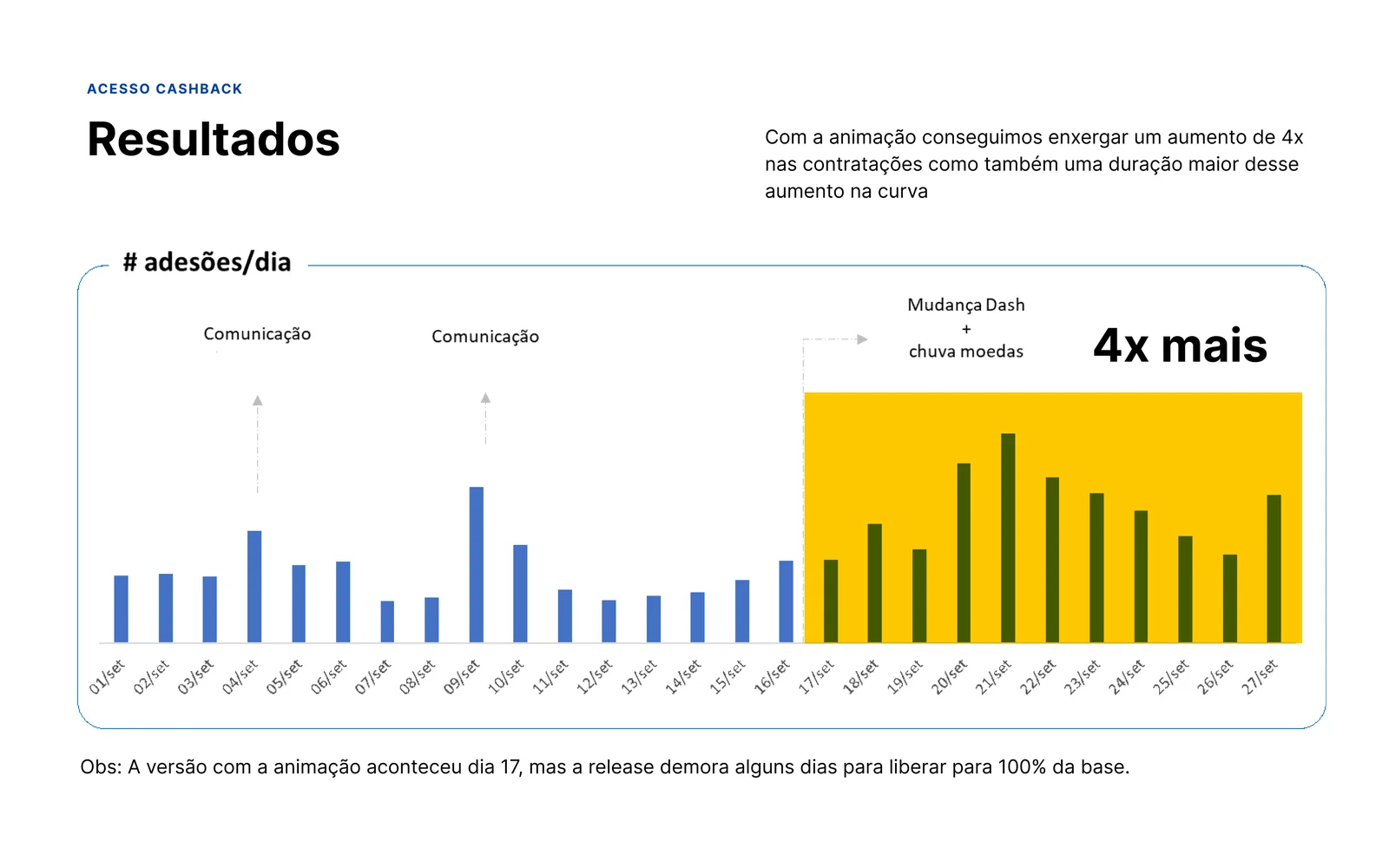
4x more daily cashback sign-ups on launch day
Role
Product Designer
Client
Neon
Approach
Co-creation with Tech Lead, Backend, Mobile Devs, PM
Outcome
4x growth in daily sign-ups, sustained over time

A month before launch,
the plan changed completely

Neon's cashback was coming to the app with a clear access architecture. Users would reach the product through two paths: from the main screen via the My Achievements hub, which brought together all the account's benefits, or through the Cards section.

A month before launch, My Achievements was deprioritized. The hub that would centralize the benefits wouldn't be ready. The two planned flows no longer existed.

The problem that landed on the table: how do you give cashback visibility without My Achievements ready, without heavy engineering effort, and without building a solution that would conflict with the hub once it shipped?
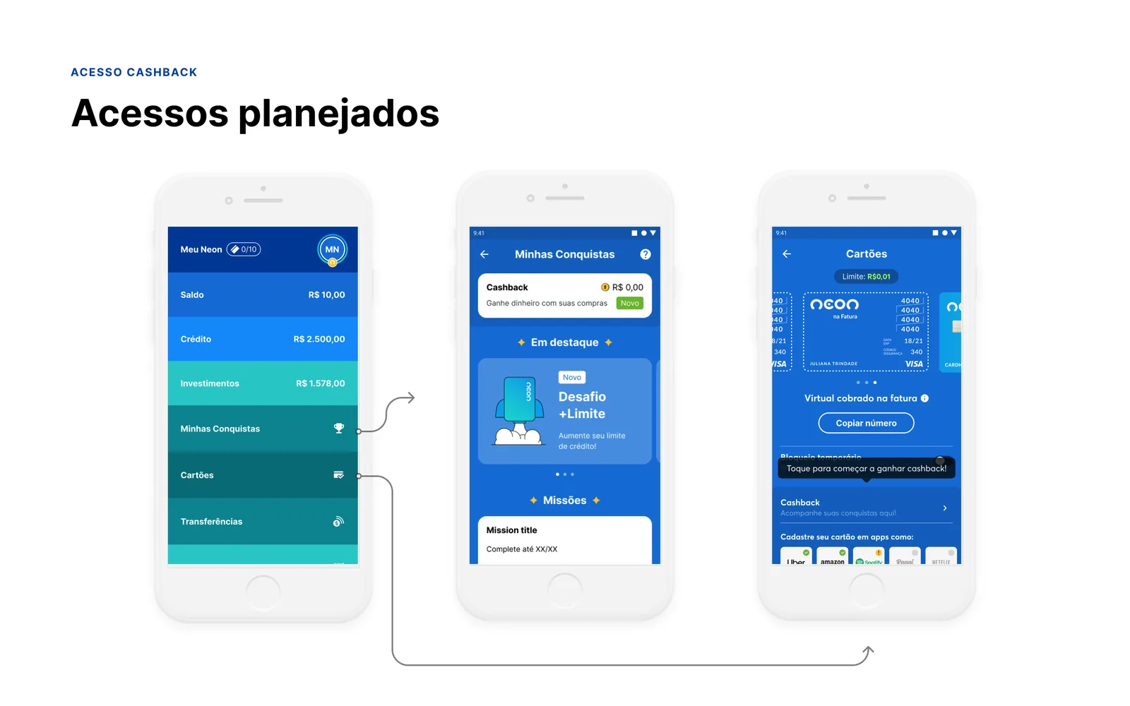
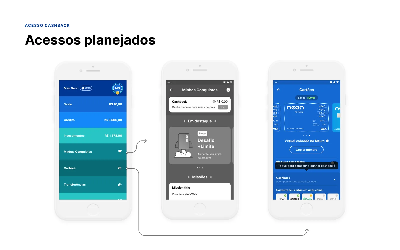
The flows that no longer existed
Flow 01
Home → My Achievements → Cashback
Flow 02
Home → Cards → Cashback sign-up

From research data
to co-creation with the team

01
Why My Achievements was the right destination
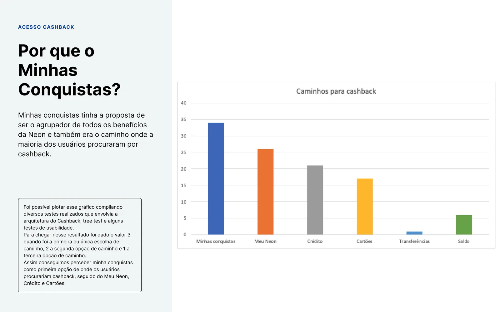
Before looking for alternatives, we validated the original architecture with data. Multiple research sessions, usability tests, tree tests, and information architecture studies confirmed that My Achievements was the most intuitive destination for benefits in the app.

The method: each navigation path was weighted by priority. 3 points for a first or only choice, 2 points for a second, 1 point for a third. My Achievements led comfortably, ahead of My Neon, Credit, and Cards. The architecture was right. The timing wasn't.
02
Benchmark: how apps introduce new features
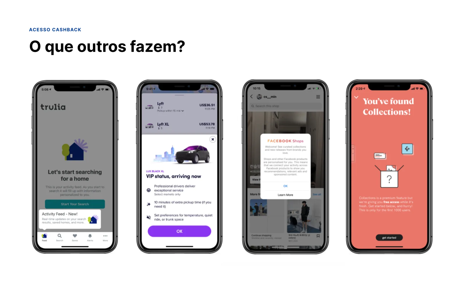
We analyzed how leading products reveal new features to users without interrupting the main flow.
Trulia
Contextual tooltip revealing a new personalized activity feed
Lyft
Full-screen modal introducing a new service tier
Facebook Shops
Interstitial discovery card without blocking the flow
Pinterest
Celebration moment when a new item is found
The pattern: a brief, low-friction, high-delight moment that introduces something new without interrupting what the user came to do.
03
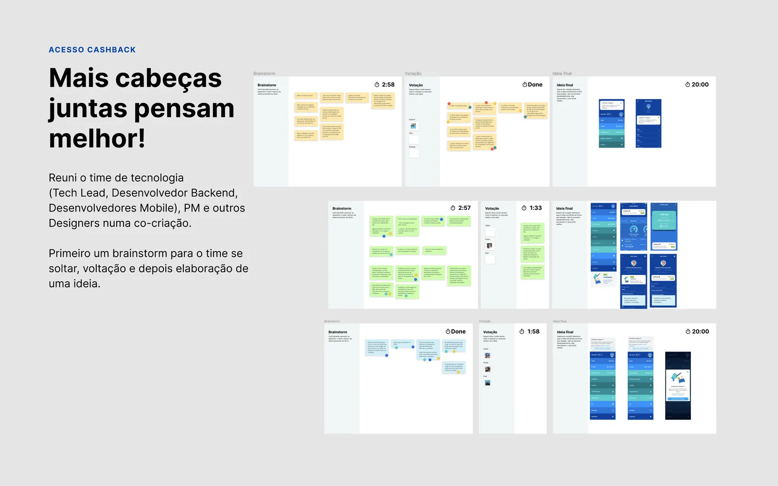
Co-creation with the team
I brought the Tech Lead, Backend Developer, Mobile Developers, PM, and other designers into a collaborative session. Format: open brainstorm, clustering of ideas, working through solutions. Three groups, three directions, convergence at the end.

The goal wasn't to reach a solution in the room. It was to make sure the technical constraints and engineering possibilities were part of the ideation from the start.
04
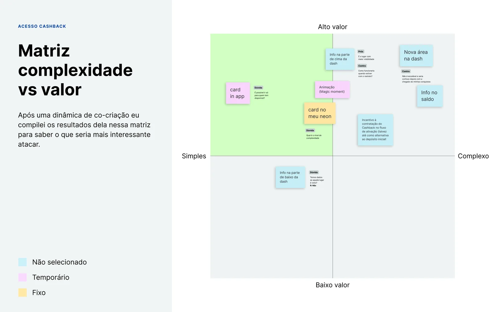
Complexity vs. value matrix
Every idea generated in the co-creation was mapped onto a matrix to identify the strongest candidates. The Animation (Magic Moment) landed in the ideal quadrant: high perceived value, low implementation complexity.
Candidates evaluated
Animation: coin shower on first access Selected
Contextual banner on the home Temporary
Launch push notification Temporary
New fixed card on the home Not selected
05
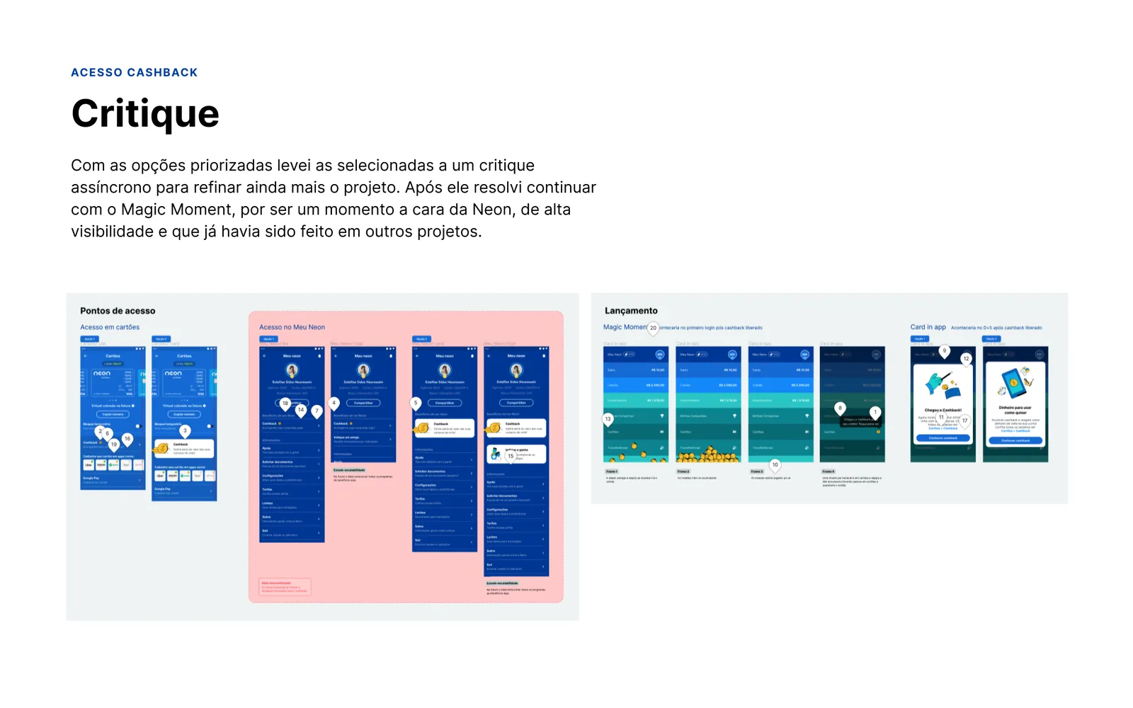
Async critique and final decision
With the candidates prioritized, I ran an async critique to refine the direction. The decision to move forward with the Magic Moment rested on three reasons: it was a high-visibility point in the user's journey, it was a Neon brand experience, the kind of detail the product was known for, and it had been validated in earlier projects with minimal technical effort.

An animation worth
more than a screen

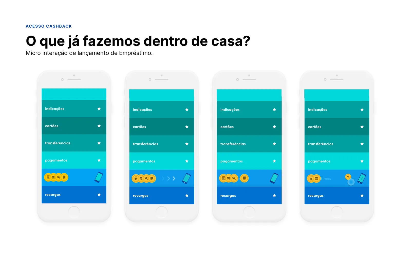
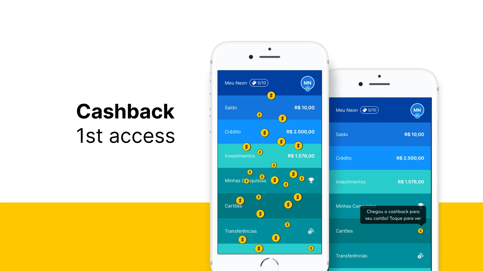
The coin shower fires the first time a user accesses cashback from the main screen. A single, celebratory moment that introduces the benefit with no extra screen, no modal, no interruption to the flow.

The solution created no dependency on My Achievements. Once the hub shipped, the animation simply wouldn't show anymore, because the user would already have signed up. No architectural conflict.

The most important design decision was not to build a permanent solution. The temptation in urgent situations is to add elements that stay in the product forever. The animation was temporary by design: it appeared once, at the right moment, and disappeared.

That also preserved the long-term architecture. My Achievements would remain the natural destination for benefits once it was ready.

The shine isn't ornament. It's evidence of mastery. The coin shower didn't exist to be pretty. It existed to make the user feel, in the first second, that they'd found something worth their while.
4x
Daily cashback sign-ups
Growth that held over time, unlike earlier spikes driven by CRM
Organic
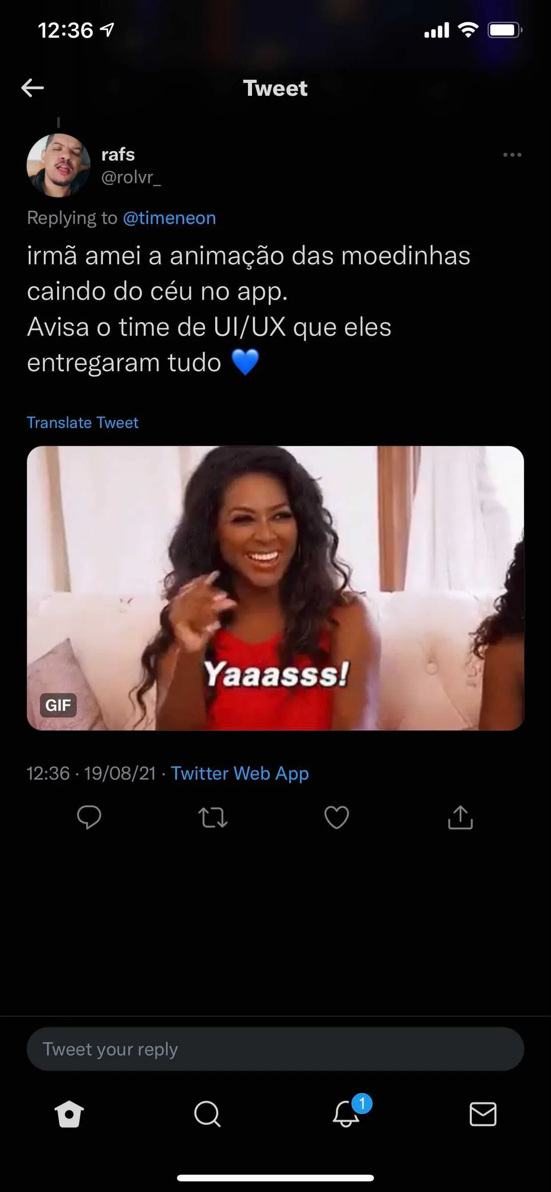
Spontaneous buzz
Users praised the UX team on Twitter with no campaign, purely on the experience
Zero
Architectural conflict
The temporary solution created no technical debt with My Achievements
See also
Insurance · Discovery · Neon + BNP Paribas Cardif
Card insurance that became a global conversion benchmark

Got a product that
needs to convert more?

A 30-minute call is enough to see if there's a fit.