Card insurance that became a
global conversion benchmark

Insurance Discovery Mobile B2C Neon + BNP Paribas Cardif 2023
Global conversion benchmark for Cardif in this insurance category
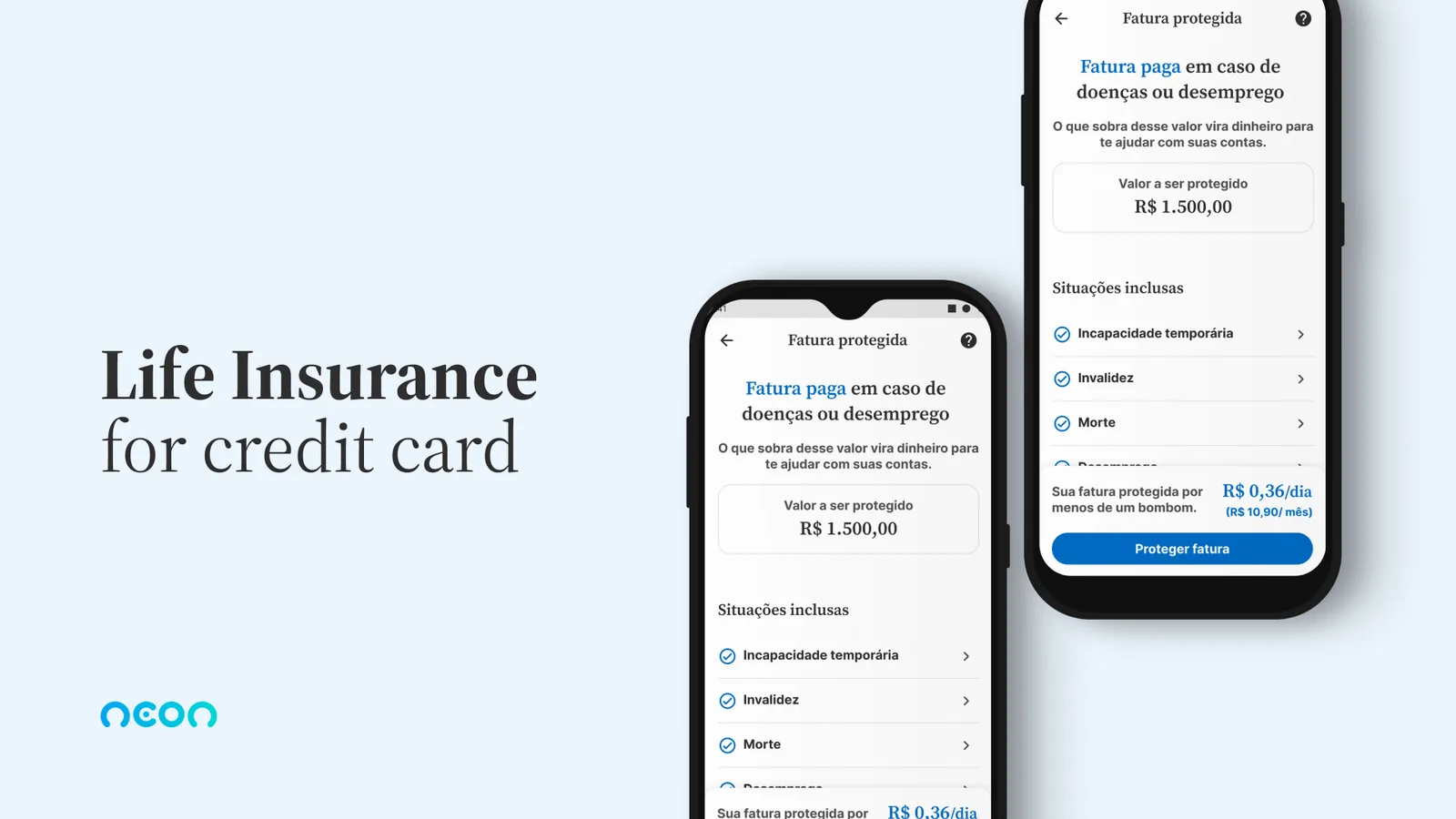
Case cover: Neon's protected-invoice insurance shown on two phone screens
Role
Product Designer
Client
Neon + BNP Paribas Cardif
Duration
2 to 3 months
Outcome
Global conversion benchmark for Cardif in this insurance category

A product for the people who
needed protection most

Neon is one of Brazil's largest fintechs, with more than 15 million customers. Because it doesn't operate as an insurer, it partnered with BNP Paribas Cardif to build a credit card insurance product from scratch.

The 2023 landscape was tough: high default rates, tight credit, a slowing economy. And 80% of Neon users had no financial protection of any kind. Most belonged to lower-income segments, with unpredictable earnings and a high risk of default.

The product had to be affordable, transparent and trustworthy for an audience that has historically distrusted insurance and struggles to claim benefits.
Carla
Self-employed, mother of two, the family's main provider. Uses her Neon card for more than 50% of monthly spending. Has never bought insurance. Sees it as complex and full of restrictions.
Self-employed Gen X & Y 2 to 3 kids Neon as primary card Fear of default

From workshop to flow
in two months

01
Value proposition workshop
We brought the product, growth and Cardif teams together to define, collectively, what made the product different: clarity, coverage that mattered to the audience, an affordable price. The starting point was a shared proposition, not a feature list.
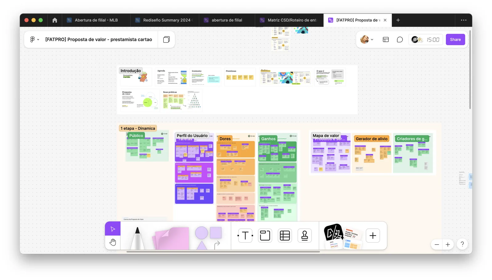
Value proposition workshop board in FigJam, with audience, tasks, pains, gains and value map
The workshop board with Neon and Cardif: audience, pains, gains and value map built together with growth, product and the insurer.
02
Quantitative research with active customers
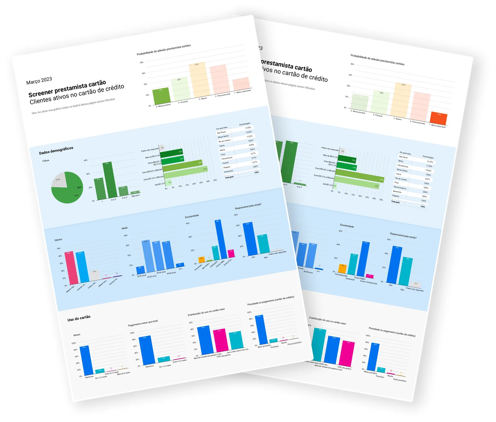
A survey with active credit users to identify the target audience and validate the proposition. Internal policy blocked us from using our own base at the time, so we worked with an active-profile sample. The result: higher propensity among Gen X, Y and Baby Boomers, self-employed women with 2 to 3 kids, primary users of the Neon card.
Survey dashboard with adoption propensity charts, demographics and card usage
Screener with active card customers: adoption propensity, demographics and card usage guided the target audience definition.
03
Qualitative interviews and perceptions of insurance
Insurance is seen as necessary by self-employed and high-exposure workers, but negative perceptions about how hard it is to file a claim and how restrictive the rules are create real barriers. The core finding: users didn't want sophistication, they wanted clarity and trust. They needed to know exactly what happens when they need to use it.

"For me, card insurance makes sense because I'm self-employed, I could be out of work and I don't have social security. I'd pay the market average, around R$9,90."

Interviewed user, qualitative research
04
Placing the flow by conversion rate
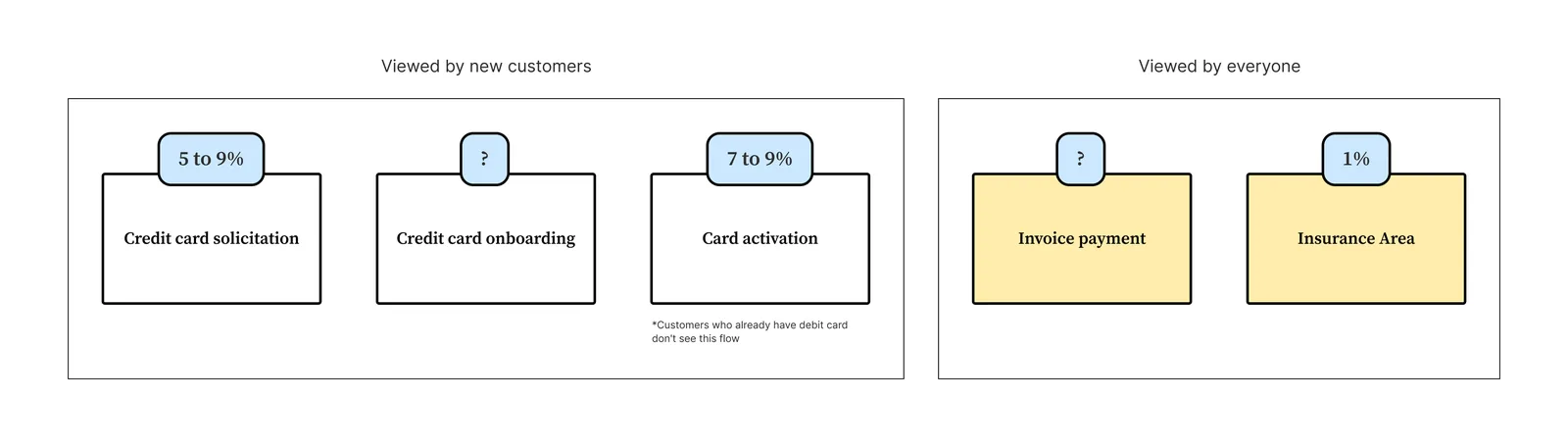
We mapped every existing entry point in the app and benchmarked conversion rates by flow. The ideal destination: access from the card screen, where the context is already credit and the user's intent aligns with the product. The flow with the highest conversion potential became the primary flow.
Diagram comparing conversion rates by entry point in the app
Conversion benchmarks by flow. The values represent the product's conversion benchmark at each entry point.

Transparency as a
conversion strategy

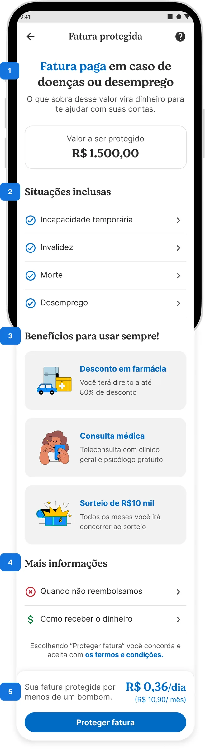
The offer screen was designed to remove every reason to say no. Instead of leading with the product, the approach was to inform fully before asking for a decision.

  • Functional headline: what the product is and what it does, no marketing language
  • Full list of coverages before any buy button
  • Price per day, not per month: a tactic already validated in CRM with higher conversion
  • Comparison to an everyday item, making the price concrete and relatable
  • Extra benefits in illustrated cards, highlighting what set the product apart
  • Plain language, no legalese, with exclusion details and the claim process made accessible

The most important design decision was positioning clarity as the competitive edge. The insurance market is perceived as opaque. A screen that shows everything before asking for anything builds trust before it drives conversion.

Price per day wasn't an anchoring trick. It was translating value into the user's own financial language, one that thinks in daily terms, not abstract monthly installments.
Insurance offer screen in Portuguese, with coverages, benefits and price per day The same offer screen translated into English
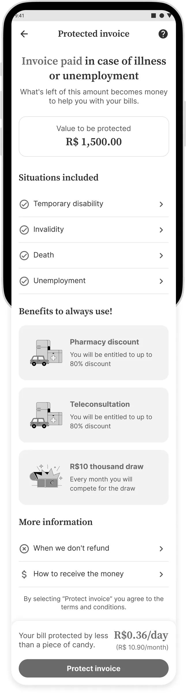
The full offer screen, original and translated. Functional title, coverages listed before the button, benefits as illustrated cards and the price per day compared to an everyday item.

One screen that became a template

The offer wasn't designed as a one-off. The flow, the offer screen and the coverage bottom sheet were structured to be reused for the app's next insurance products, with the coverage list, the benefit cards and the price per day working as content slots rather than a fixed layout.

Acquisition was 100% in-app, with no landing page or capture page, and the same offer had to work across three entry points: bill payment, card application and direct access. One layout per entry point would have tripled the cost of every new insurance product.

Why it matters: the conversion gain belongs to Fatura Protegida. The template belongs to Neon. The next insurance products would start from a validated pattern instead of a blank screen.

Benchmark
Global conversion benchmark for Cardif
Highest conversion rate in the category among BNP Paribas Cardif partners
Template
A reusable pattern for new insurance products
Flow, offer screen and coverage bottom sheet built to scale
3
Entry points in the app
Bill payment, standalone and card application, 100% in-app acquisition
Next project
E-commerce · Self-service · Mercado Livre
A re-invoicing flow that cut support requests by 70%

Want to talk about
this project?

Happy to walk through the decisions behind it, by email or on LinkedIn.